User Experience Research · User Experience Design · Campaign Design
How we made Mayo Clinic’s FL campus safer for pedestrians

A design-led safety transformation
Role
UX Researcher
Campaign Designer
Skills
Data Collection Data Synthesis
Insight Generation
Trend Analysis
Conceptualization
Behavioral Nudging
Campaign Design
Story-telling
Duration
10 weeks
Design Brief
Collaborate with the Mayo Clinic to improve overall safety for all pedestrians on campus through enhanced crosswalk experiences.
My Role
I applied my ability to collaborate effectively within cross-functional teams.
As a UX Researcher:
-
I uncovered critical insights by analyzing pedestrian traffic pattern and conducting in-depth stakeholder focus groups to identify pain points.
-
Designed targeted behavioral nudge interventions based on our findings that addressed crosswalk safety issues and informed the comprehensive safety campaign I co-designed with fellow researchers on the team.
-
Worked alongside 3 teammates to develop the UX flow for the redesigned Mayo Clinic mobile app, ensuring it aligned with user needs and the overall safety and wellness objectives of the project.
Overall, I worked closely with a team of service designers, architects, industrial designers, illustrators and project managers.
My Impact
By applying proven behavioral nudges to the unique context of Mayo Clinic, I designed a safety campaign that not only tied back to the user pain points we uncovered, but also enhanced the natural beauty of the Florida campus.
The problem
Mayo Clinic Jacksonville faces a critical safety triangle: heavy traffic, failing crosswalks, and hurried, distracted visitors leads to unsafe crossing for pedestrians on campus
The challenge
42% of near-misses occurred due to distracted phone use near crosswalks (per Mayo Clinic data)
The outcome
A 3-pronged system that increases on campus pedestrian safety by 25% in simulations through a enhanced mobile navigation, safety campaign and pedestrian-prioritized crosswalks
Who we designed for

The fear of accidents due to short crossing signals and fast-moving traffic
Anxiety from navigating a large campus while caring for loved ones
The stress of navigating a large campus while trying to reach a destination quickly
The urgency to reach a specific area raises fears of accidents from short crossing signals and fast traffic
The struggle with unfamiliar layouts and the distraction of personal concerns
Research goals
Understand the behaviors and attitudes of both pedestrians and drivers regarding current crosswalks.
01
Identify issues and limitations of existing crosswalks, with a focus on safety, visibility, and efficiency.
02
Explore existing tools and technologies that can enhance crosswalk design and usage.
03
Assess the impact of proposed solutions on user experience and safety.
04
Emotional insights from archetypes


The fear of accidents due to short crossing signals and fast-moving traffic highlights a need for more time and safer crossing conditions
The Cautious Patient
Anxiety from navigating a large campus while caring for loved ones indicates the need for
a well-signposted environment that soothes and directs
The Overwhelmed Caregiver
The stress of navigating a large campus while trying to reach a destination quickly
The Impatient Driver
The urgency to reach a specific area raises fears of accidents from short crossing signals and fast traffic
The Rushed Staff
The struggle with unfamiliar layouts and the distraction of personal concerns
The Distracted Visitor
An overview of my approach

Mapping the safety landscape: Campus wide issues deficiencies
The Mayo Clinic Jacksonville campus map with the 3 sites that faced major pedestrian safety concerns.

The function of each site:

Main campus entry and exit point
A
Patient facing

B

C
Valet speed zone
+ bad visibility
Staff facing + drop- off area
Mixed use
Staff facing
Campus wide issues observed
FL weather effect on building-to-building transport
Warning lights not linked to pedestrian crossings
Unclear parking areas, lack of indicators showing vacancies
Change in material
(not ADA) before crosswalk
No clear way-finding due to lack of signages
Mapping the safety landscape: Archetype's journey specific pain points

Main campus entry and exit point
A

Opportunity area
Designing for the cautious patient by creating a calming and easy to navigate environment to enhance their experience from the moment they get on campus

Valet speed zone and bad visibility
B

Opportunity area
Designing for the rushed drivers and visitors, providing clear way finding and a holistic or grounding experience.

Valet speed zone and bad visibility
C

Opportunity area
Designing for the rushed staff member keeping functionality and ease of movement from point to point in mind.
Desired State: Mayo Clinic crosswalk as a model of accessibility, efficiency, and shared respect - leveraging innovative solutions to optimize flow, enhance safety, and cultivate a sense of tranquility
amidst a high-traffic environment.
Our solution recommendations
We developed solutions across 4 focus areas, each designed to address distinct user pain points
Behavioral Safety Campaign
A behavior-driven campaign that promotes mindful, safe commuting by leveraging the scenic campus, bold visuals, and inclusive messaging to prioritize well-being over speed
Pain points addressed:
Underutilized scenic features, navigation stress, phone distractions, low visibility crosswalk, missing guidance signage
Integrated physical & digital wayfinding*
A cohesive physical-digital wayfinding system that blends minimalist design with natural materials to create an intuitive, real-time navigation experience
Pain points addressed:
Fast-moving traffic, navigation stress and cognitive overload, phone distractions, signage either worn out or missing
Intuitive Digital Experience
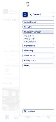
An intuitive app enhancing patient and staff journeys with smart wayfinding, safety alerts, and access to campus services
Pain points addressed:
Difficulty in way finding, phone distractions, low visibility crosswalks, signage either worn out or missing
Architectural Innovations*
Human-centered outdoor features—from a skywalk to shaded rest areas—designed to improve comfort, connectivity, and environmental integration
Pain points addressed:
Heavy fast-moving traffic, short crossing signals, rash driving, slow routes during urgencies


*These solutions were developed by the graphic design and architectural teams respectively.
.png)
Our campaign blends behavioral science, nudges, and wellness messaging to make every crossing safer for all campus pedestrians whether it is patients, drivers, staff, or visitors while showcasing the campus as a place for health benefits through walking and exploration.
CAMPAIGN DESIGN
Changing crosswalk behavior on a busy hospital campus
Nudging users out of auto-pilot mode into conscious, mindful interactions behavior by hacking the 95/5 framework*

*95/5 framework = 95% of the time users act on auto-pilot; 5% is done actively aware
Our goal: Shift user behavior by guiding them from their current emotional state to an ideal one
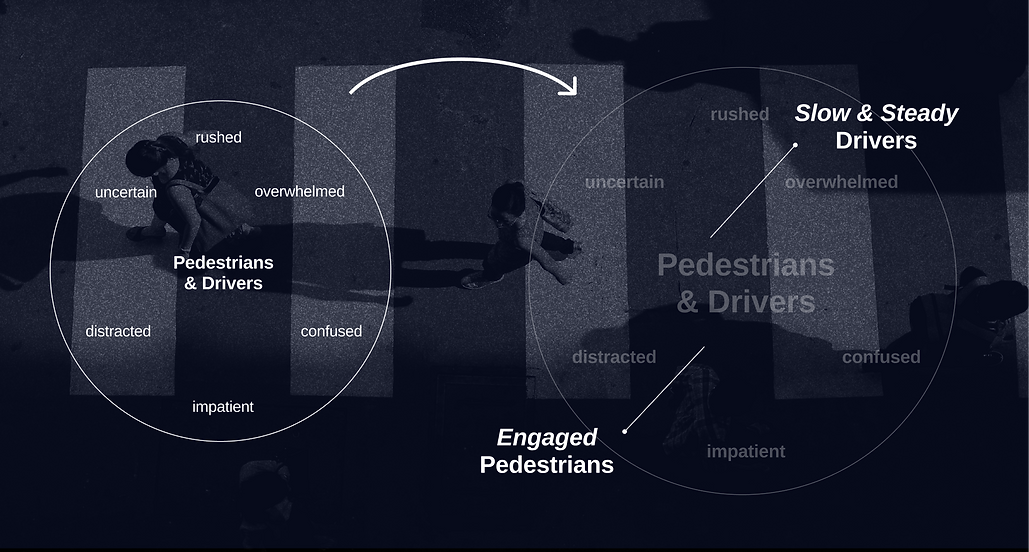
current state
ideal state
Our 3 phase campaign
The slogan
Safety in every step,
beauty in every corner.
The message
Promote an interactive campus that creates a safe environment for both pedestrians & cars.
The phases
Promote walking
Promote safety
Promote wellness
The journey
Introduction
Phase 1
Phase 2
Phase 3
Look up
Campaign
Discovery
Cross with care
watch your step
Enjoy what
is around you
Introduction: Campaign Discovery
Our users need
Got people to think about
& embrace safety as a part
of their everyday routine
Consistent messaging and infrastructure that reinforces safety everywhere they go on campus


Campaign integration
on app through QR scan
Integration
on social channels
Reinforcing our campaign message about safety
Scan to know about the campaign
Phase 1: Look up | Promotes walking
Promoted Mayo Clinic
as a sanctuary that invites people to use its campus grounds for walking
Our users need
Safe, restorative walking areas that support physical and mental well-being


Visual cues
to encourage walking
Highlighting the
campus's rich biodiversity
to encourage walking
Phase 2: Promote safety
Use strategic elements to
leverage existing points of interest on campus to instill a more conscious mindset
Our users need
Subtle yet consistent cues throughout their daily routes that encourage them to slow down and feel safe, without disrupting their flow
Leveraging existing
Google Maps tech


Evidence-based
behavioral interventions
Messaging to break the phone
distraction pattern while crossing
Evidence-based
behavioral interventions
Using campus vehicles to
push our safety message
Phase 3: Promote wellbeing
Our users need
Increase the prominence of other
commuters on campus and position the grounds as a wellness destination
for walking and discovery
To feel connected and aware of others around them, while having inviting spaces that encourage walking, exploration, and well-being.
Visual cues
to encourage walking
Inviting people
onto campus


Pause- Stroll- Breathe- Repeat
.png)
Creating a mobile experience that enhances campus navigation while promoting safety and mindfulness.
MOBILE APP EXPERIENCE
Your holistic healthcare companion
Stay on track for all
of your appointments
Feature 1
No more parking stress, let our parking recommender guide you
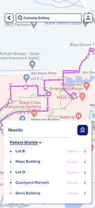
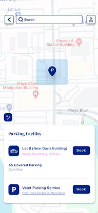
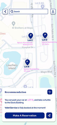
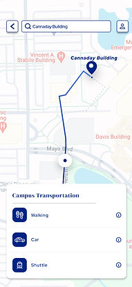
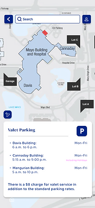
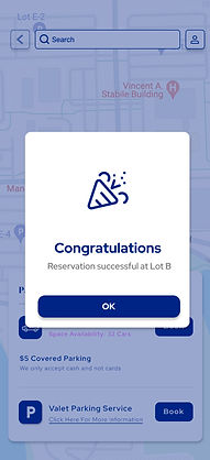
Don’t miss out- the app also helps you navigate campus transportation and beyond

An intelligent
way-finding
system
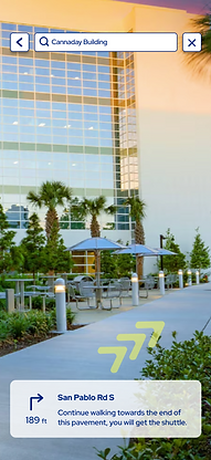
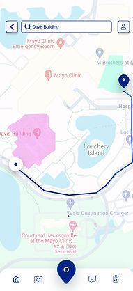
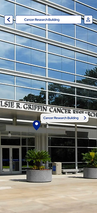
Seamless travel between buildings powered by color-coded, AI-smart navigation.
Feature 2
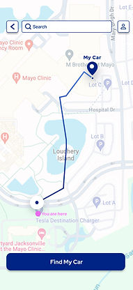
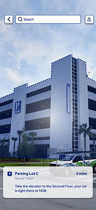
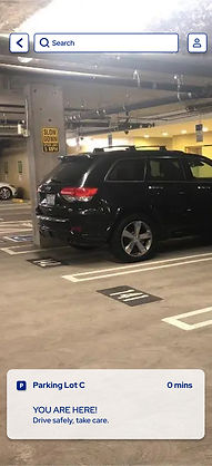
Helping you find your car and parking lot in no time


My learnings as a UX Researcher
-
I learned how to pivot effectively. What began as a project focused on crosswalk safety evolved into a broader initiative addressing overall campus safety and pedestrian well-being.
-
This project reinforced in me the ability to work closely with other teammates and unite toward a shared goal and solution.
- I realized that not every challenge needs a big fix; sometimes, small nudges can be enough to guide our users towards desired behaviors.


